My work on the software for the original iPhone was focused on the keyboard. Through twists and turns, it became my job to make an autocorrect feature, to turn your acxuratw tyoinh into accurate typing.
We didn’t know if typing on a small touch-sensitive sheet of glass was technologically feasible or a fool’s errand. As commonplace as virtual keyboards have become, in those days, the norm for smartphones was the BlackBerry, with its built-in hardware keyboard, its plastic chiclet keys, and its tactile thumb-typing. The iPhone keyboard was never going to have a hardware keyboard. Instead, it would offer tiny virtual keys that gave no feedback you could feel with your fingers.
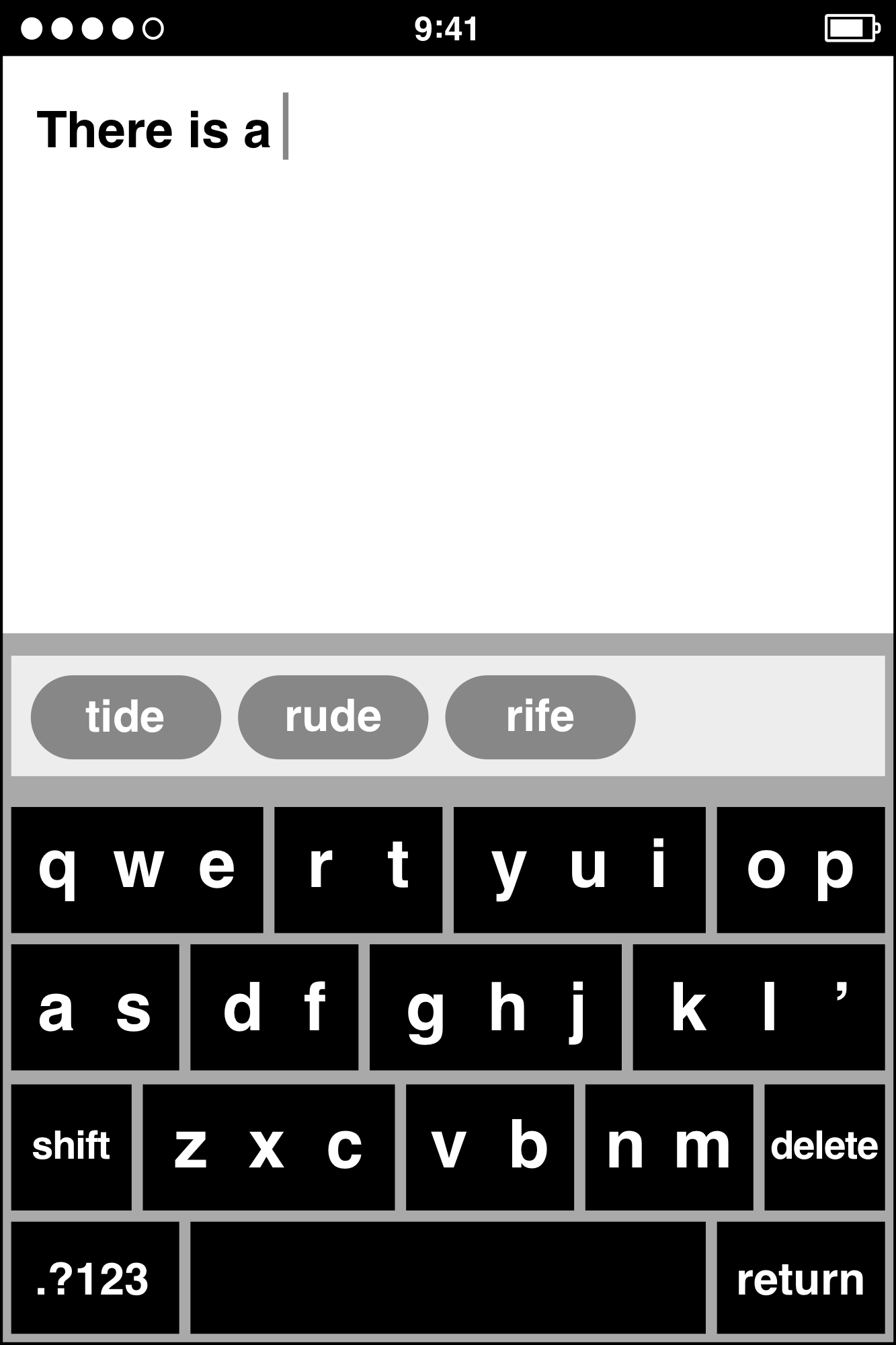
In my earliest partially-successful prototype (pictured below), I ganged up multiple letters onto each key, and I wrote software to figure out which letter you meant for each key press. This worked for common words, but here's an excerpt from my book Creative Selection in honor of International Talk Like A Pirate Day. It describes how this silly seafaring celebration turned into a stumbling block for this software keyboard prototype.
— Ken

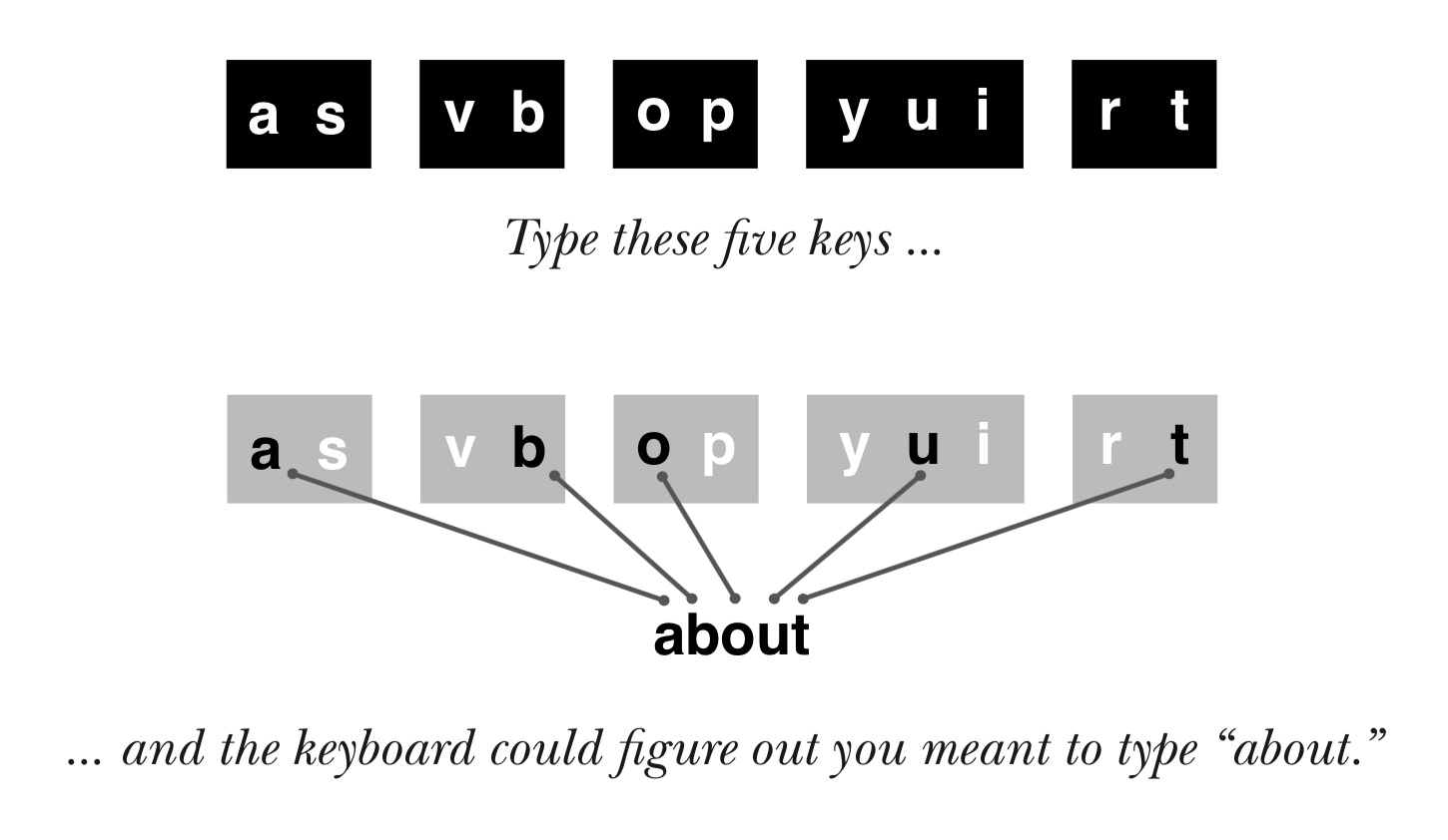
Consider what it would be like to type a word on a keyboard where there were multiple letters on every key. Typing a key made all the letters on that key a possible choice for that position in the word. Tapping the as key made it just as likely you meant to type a word that began with “a” or “s.” As you typed more keys and then tapped space, the software would offer the best word for all the keys you typed by selecting the best letter for each position.

This scheme worked well for common words, and every new word I added to the dictionary made it work even better. Typing people’s names was another matter. What if you had a friend named Teemu? Since I never added dictionary entries for popular given names for men from Finland, typing his name was impossible. My keyboard had no trouble for finding paths for ordinary English words, but the software couldn’t find a path through a succession of keys for a name like Teemu, since his name wasn’t in the dictionary.
If you typed these five keys for the name “Teemu,” you were out of luck. Since this name wasn’t in the dictionary, the keyboard couldn’t match it.

The problem for uncommon words was similar. What if you wanted to type a gibberish word on purpose? This happens much more than you might think. Every year, September 19 is International Talk Like a Pirate Day. On this humorous holiday, people want to type one word above all others: Arrr! Of course. But how do you spell it: Arr? Arrrr? Aarrrr? Aarrrrr? To make it easy and convenient for people to type like a pirate, I would have to add every one of these “Arrr!” permutations to the dictionary, since the keyboard wasn’t “smart” in any way. It didn’t have any built-in knowledge of English. It couldn’t make inferences or sound things out. The keyboard could suggest a word only if the dictionary contained an exact entry for that word.
How could I help people type Finnish names and onomatopoeia? I didn’t know. Could I add all the names for all the world’s languages, and if I did, could I reliably differentiate between a misspelled word and an uncommon name? I doubted it. Could I anticipate every bit of humorous babble people might want to type? Fuhgettaboutit.
These problems illustrate a common product development quandary. People who love tech gadgets want new products that do cool new things. This creates the customer demand that gives product developers like me incentive to add new features. Yet none of us wants these products and features to be confusing, to lead us astray, to drive us down a software dead end and dump us there. We’ve all owned devices that had too many ill-considered, overlapping, and inscrutable features, making the products nearly impossible to understand or use. Apple’s whole identity was bound up in not having this problem.
Over time, I came to the conclusion that designing an excellent user experience was as much about preventing negative experiences as facilitating positive ones. It couldn’t be an even trade-off either. Great products make people happy almost all the time and do the opposite rarely, if at all. This worried me because, as matters stood, my derby-winning keyboard might wipe the smile off someone’s face on International Talk Like a Pirate Day. On that holiday, my keyboard had to deliver on Arrr!, not cause people to give up in frustration, exclaiming “Argh!”
If you want to know how Ken solved this problem and how this multi-letter keyboard evolved into the iPhone keyboard that shipped in the product, buy a copy of Creative Selection and find out! Got a comment? Find Ken on Twitter. In the meantime, arrr!
Excerpt above from CREATIVE SELECTION: Inside Apple’s Design Process During the Golden Age of Steve Jobs by Ken Kocienda. Copyright © 2018 by the author and St. Martin’s Press.

